From Data to Insights: Revamping the Analytics Experience for Property Owners
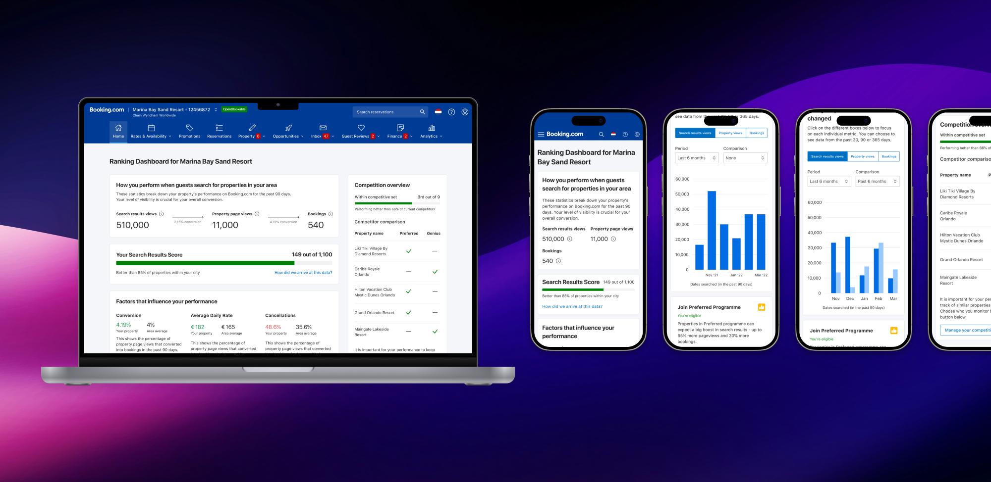
The ranking dashboard at Booking.com is where property owners check their visibility on the guest-facing site, including search and hotel page impressions, booking trends, and the number of reservations over time.
Initially, the dashboard was quite basic and, as we later discovered, did not fully meet the users' needs.
- My role
- Lead designer
- Teams
- 2 Product teams, Org Product leader, Data scientist, UX Writer, UX Researcher, Engineers
- Timeline
- 3 months
Impact summary
- Support burden reduced - partner help-centre visits down within first quarter.
- Compset creation increased after launch, indicating higher feature adoption.
- Property page scores improved, suggesting better content quality and completeness.
- Did not materially lift premium programme sign‑ups → informed follow‑up strategy.
Scope & leadership
- Drove discovery, defined UX principles, and success metrics with product leadership.
- Facilitated cross‑team alignment across 2 product teams and data science.
- Owned end‑to‑end design across web and mobile; partnered on instrumentation.
- Led decisions on metric semantics, timeline design, and upsell strategy tradeoffs.
Problem & goals
- High support ticket volume — partners were confused by the data the dashboard surfaced, confirmed by local account managers.
- Metrics were insufficient for partners to make effective strategic decisions about discounts and visibility.
- Opportunity to cross-sell premium programme memberships and reduce support burden.
Defining product & UX principles
Reliability
This was a metrics product and partners relied on it to make key decisions, we had to ensure we’re providing the right data.
Transparency
The narrative needs to be clear and transparent so our users always have a clear understanding of the data that they’re seeing.
Consistency
Being consistent with metric representations in other property facing products.
Research
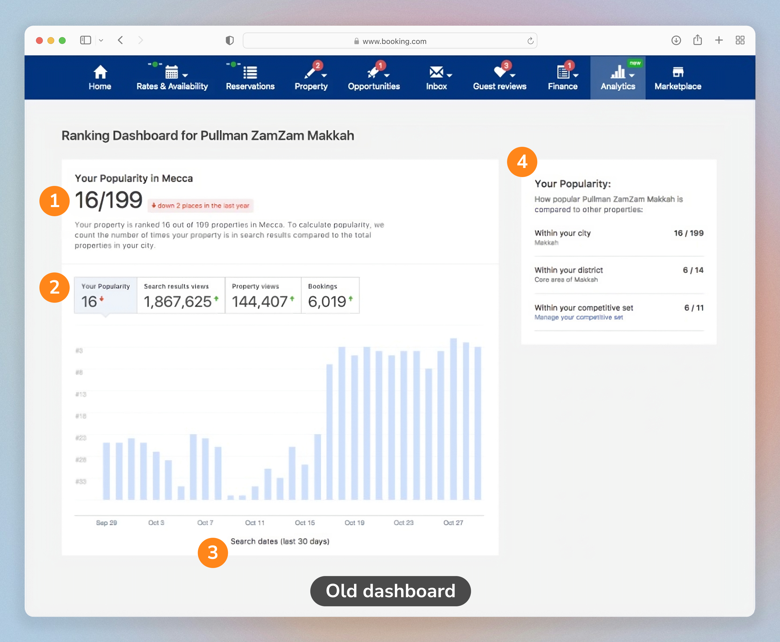
- Partners often mistakenly took the popularity score as an indicator of their position in the search results.
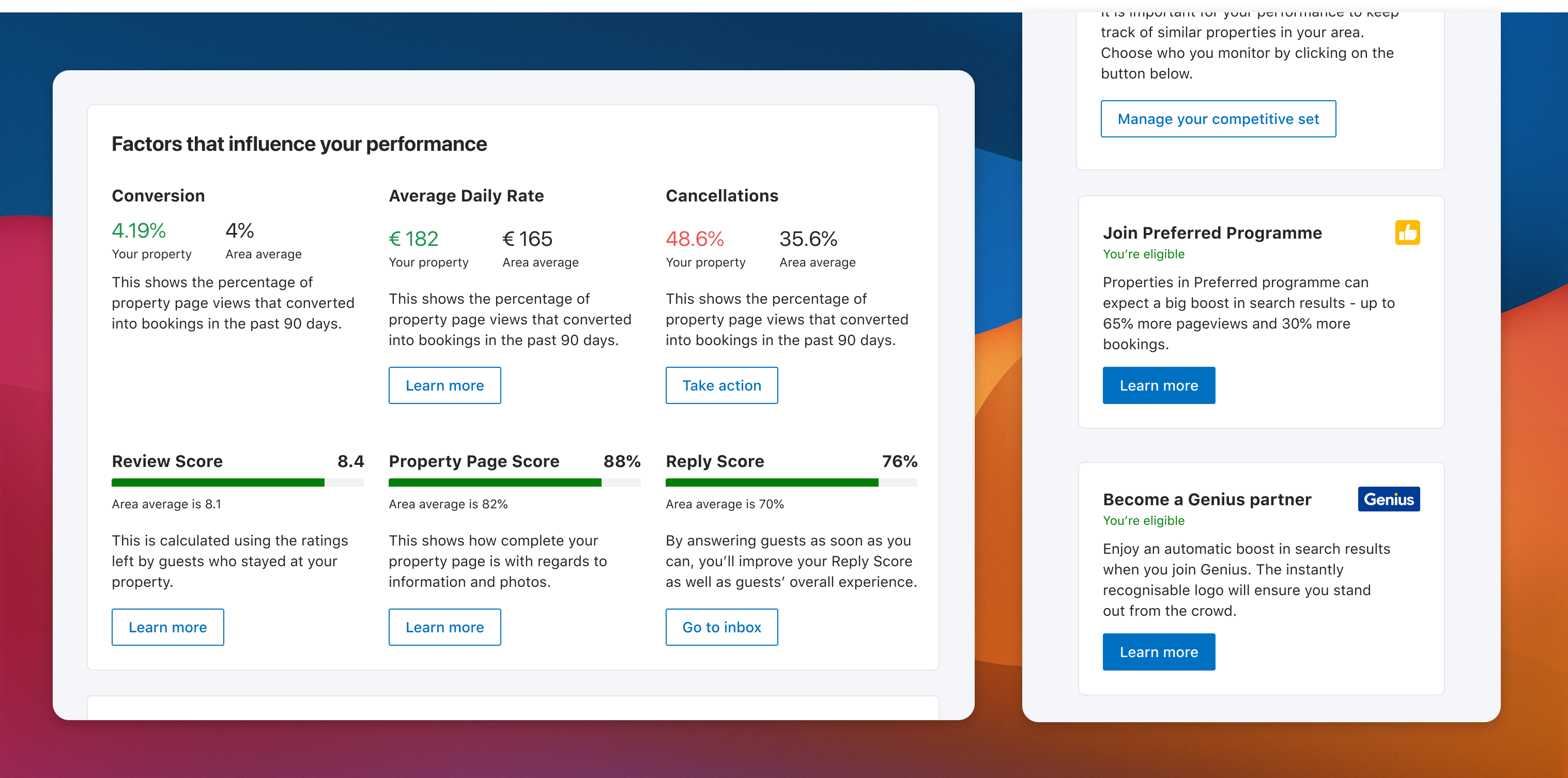
- Crucial data points like conversion missing. Cancellations, content/review scores were also expected.
- The 30 days worth of metrics shown on the page weren’t enough information. There was also a need to be able to compare with past quarter and yearly data.
- It’s unclear how the competitive set is calculated and why partners can’t set it up themselves.
With the insights from explorative research, I led a session to define our problem statement that addressed the pain points and the business goals.
How might we provide property owners with a clear picture of their property’s performance and provide them with actionable insights while driving premium programme signups?
I also used this opportunity to define some of our success metrics.
- Graph interactions
- Score improvements
- Compsets created
- Programme signups
- Support tickets
- Help centre visits
Key decisions & tradeoffs
- Reframed “popularity score” to avoid ranking misinterpretation; added contextual copy and benchmarks.
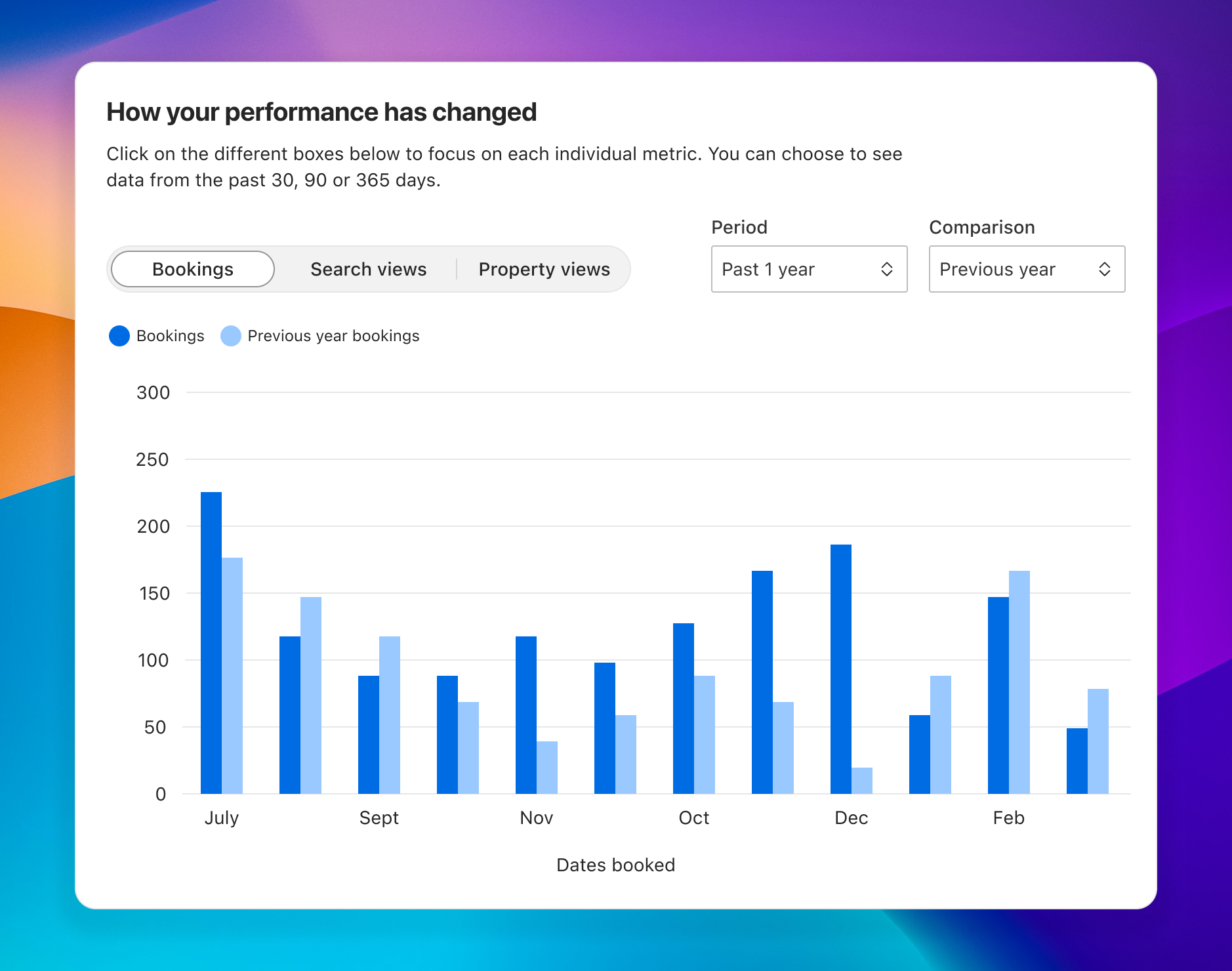
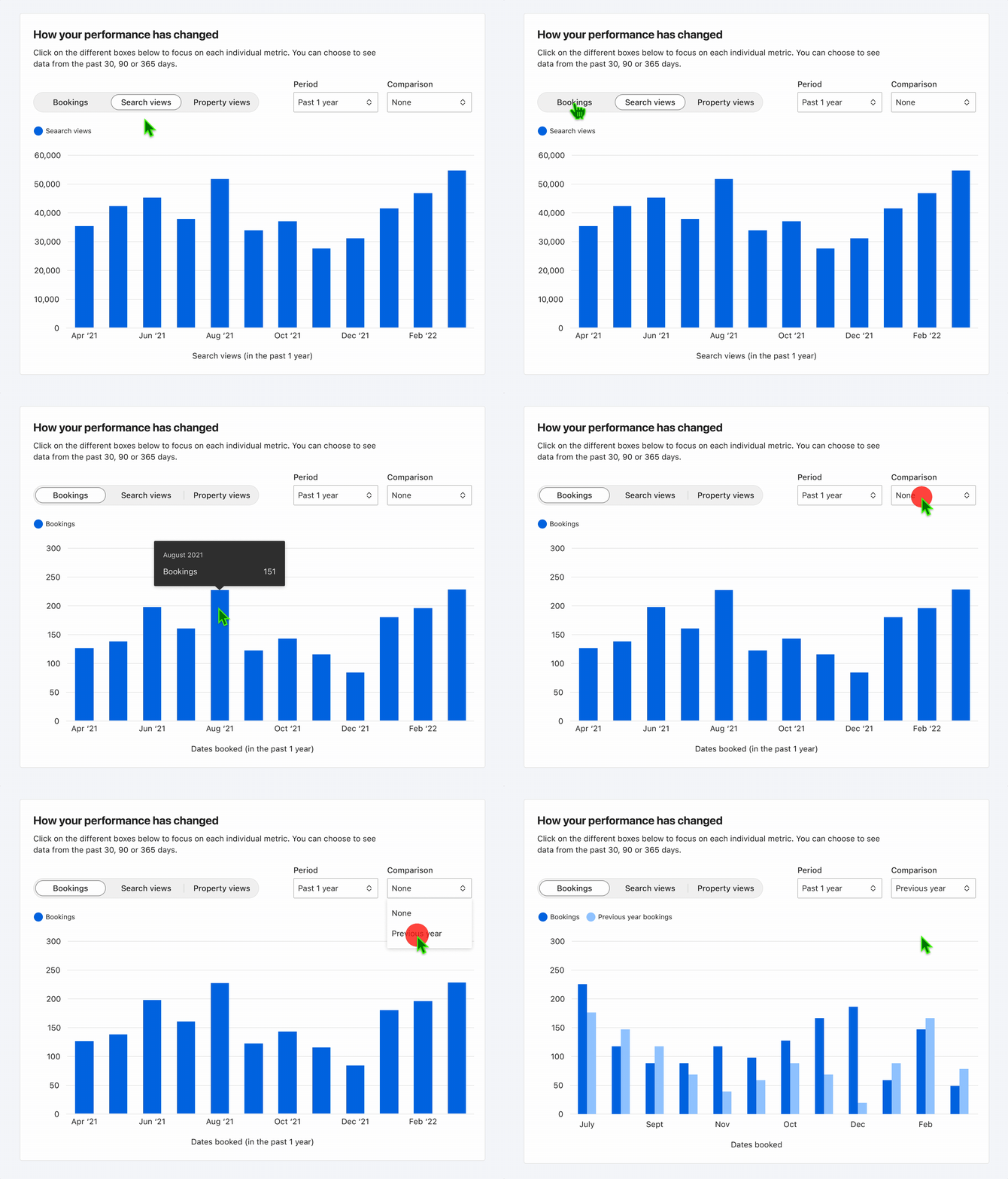
- Extended timelines with compare mode; constrained mobile to 6 months to preserve readability and tap targets.
- Prioritized clarity over density: progressive disclosure for advanced metrics to reduce cognitive load.
- Conditionally surfaced upsell banners only on performance dips to protect trust.
Explorations
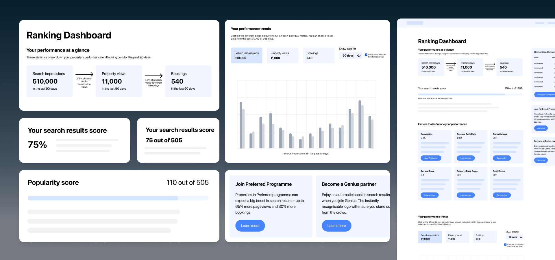
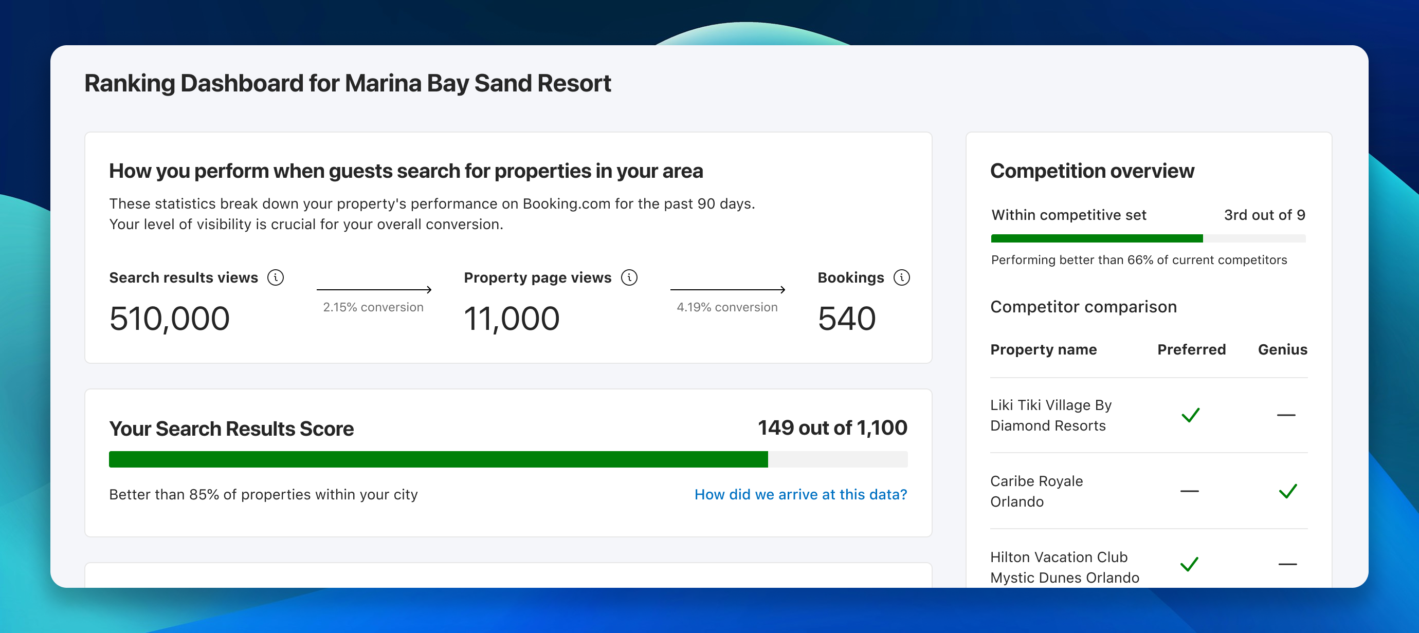
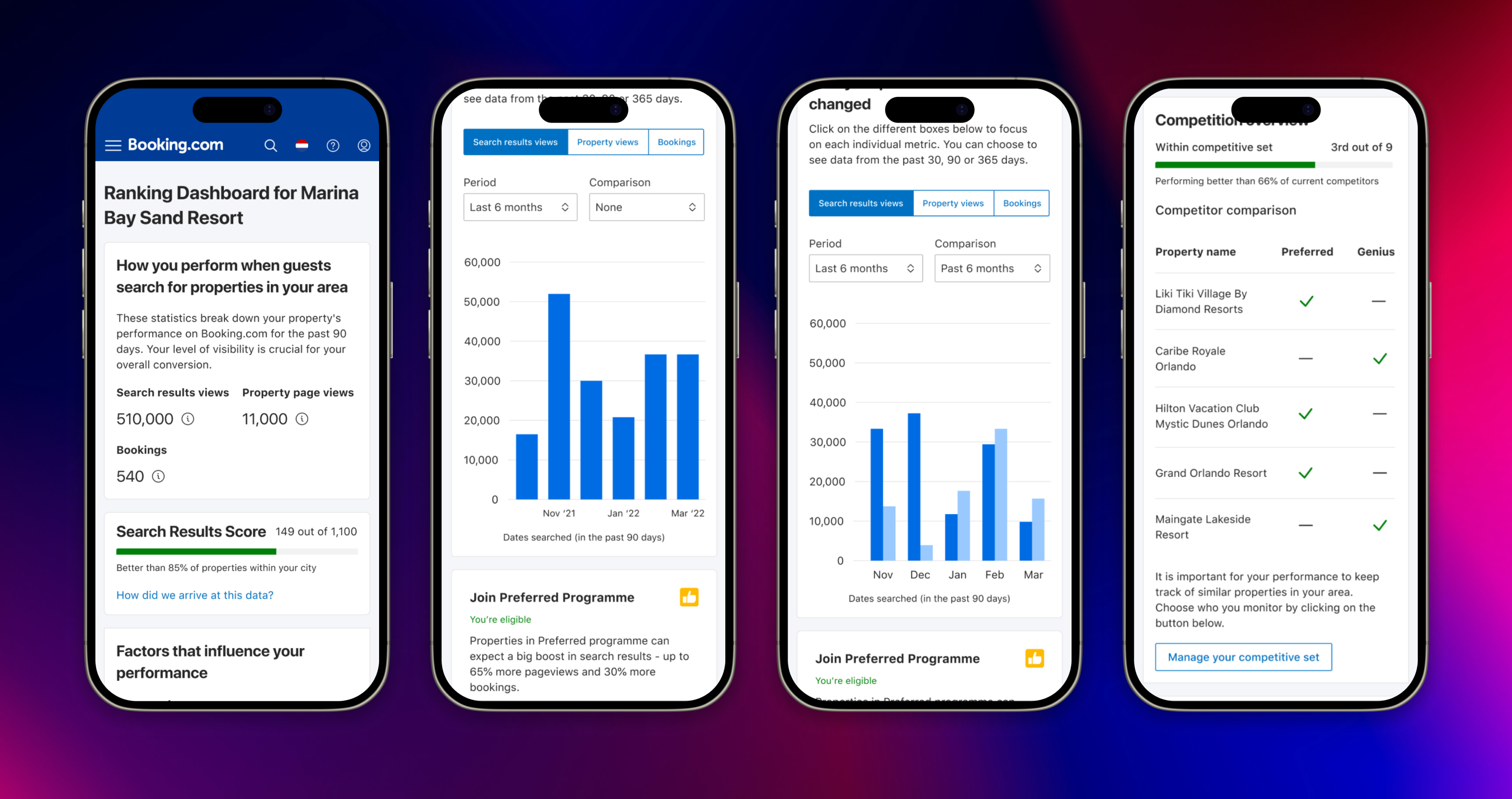
I went wide with wireframes, exploring how to reframe the popularity score as a dynamic metric, surface a “performance at a glance” funnel, extend timelines with compare mode, and conditionally show upsell banners on performance dips.
Final designs
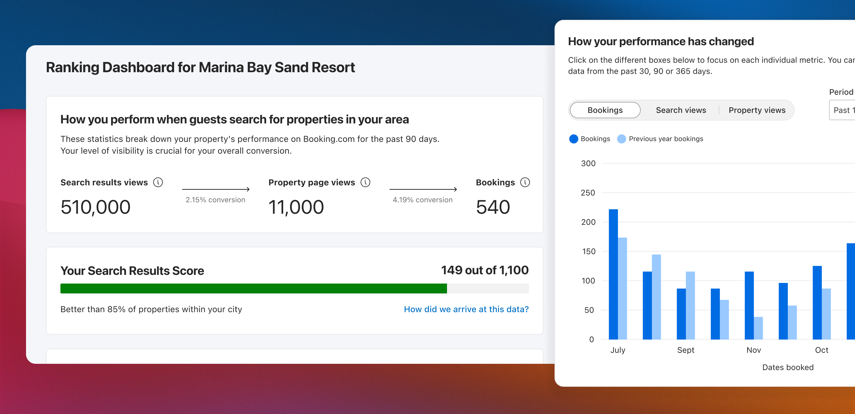
The delivered designs across web and mobile, addressing each of the pain points identified in research.
Impact & Learnings
- Support tickets down — noticeable drop in help-centre visits within the first quarter, indicating improved data clarity.
- Compset creation up — significant increase in partners actively using the competition widget after launch.
- Property page scores improved — suggesting better partner self-awareness around content quality and profile completeness.
- Premium programme signups did not lift materially — informed follow-up work on upsell timing and whether the connection between performance dips and programme value was clear enough.
Next steps
- Run experiment on contextual upsell timing linked to specific performance dips.
- Introduce lightweight goal‑setting and progress nudges for key metrics.
- Expand compare mode to cohort benchmarks by market and star‑class.
- Tighten copy and in‑graph annotations to prevent metric misinterpretation.