Designing for growth at PepperTap
Lighter sign-up, faster shopping, fewer abandoned carts.
A data-led redesign of PepperTap’s iOS and Android apps, where I set the success metrics first and designed every change to move them.
PepperTap was a hyperlocal grocery delivery service, launched in India to give people a fast, seamless way to buy groceries.
Highlights
- Metrics-first: I instrumented the funnel and agreed the target metrics before designing anything.
- Simplified the path to purchase: a lighter sign-up, 3 taps down to 1 to reach products, and a leaner checkout with smart defaults.
- Measurable impact: onboarding abandonment down ~18%, abandoned carts down ~9%, and order volume up ~7%, feeding revenue directly.
My role
I led the end-to-end redesign of the customer-facing iOS and Android apps, working alongside the product owner, a data analyst, and platform engineers.
Where the funnel was leaking
The apps were losing users at every stage: low engagement, heavy drop-off on first launch, and a high rate of abandoned carts at checkout. My job was to find where the funnel broke and fix the biggest leaks first.
I focused on the stages with the clearest data and the most upside: getting users to products faster, and getting them through checkout, rather than redesigning everything at once.
Starting with the data
I began with the numbers, analysing order share across product categories over the previous quarter. One signal stood out: Fruits & Veggies alone drove 37% of orders, a clear sign of what users came for most, and that the category tree wasn’t built around real demand.
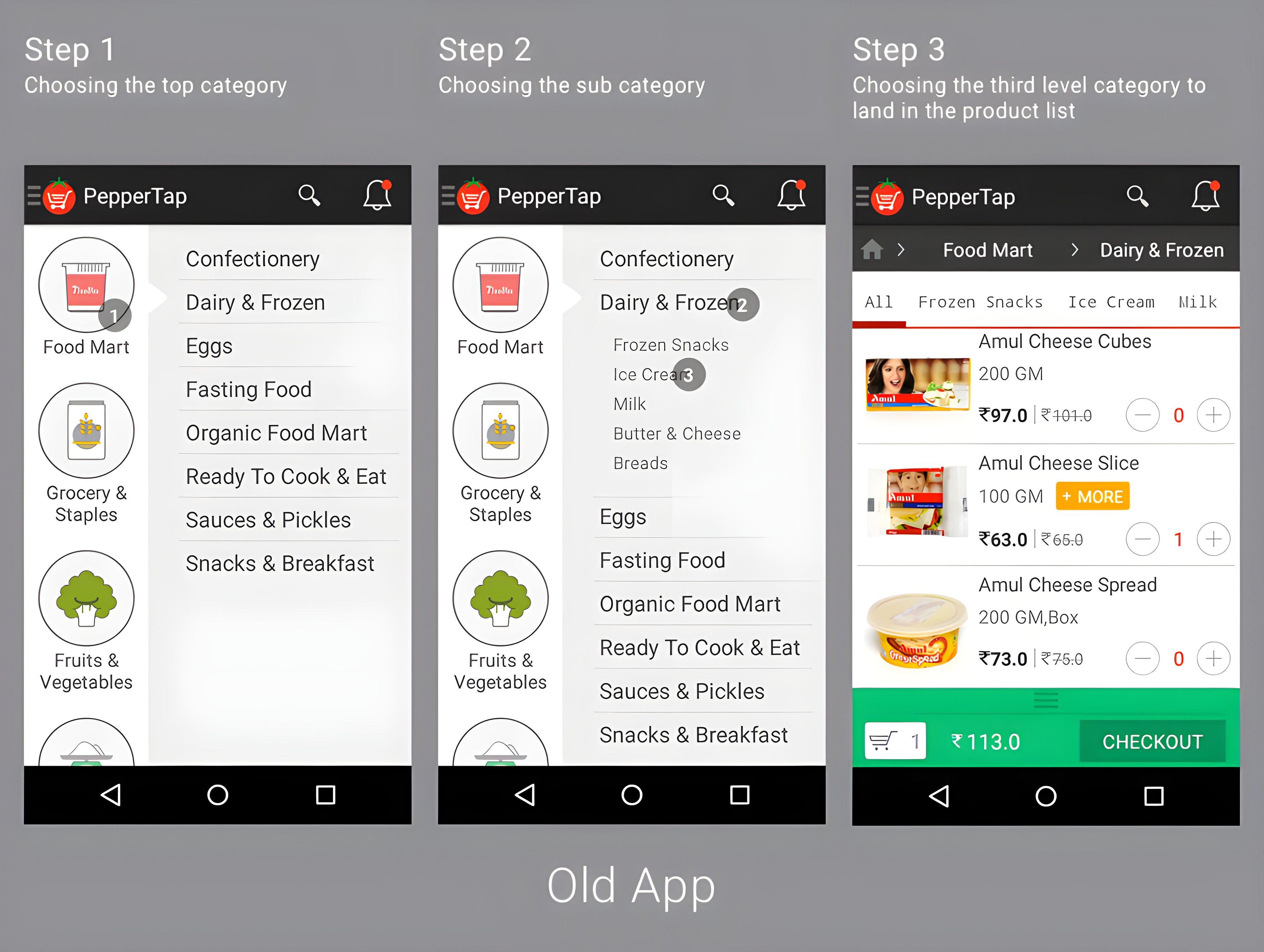
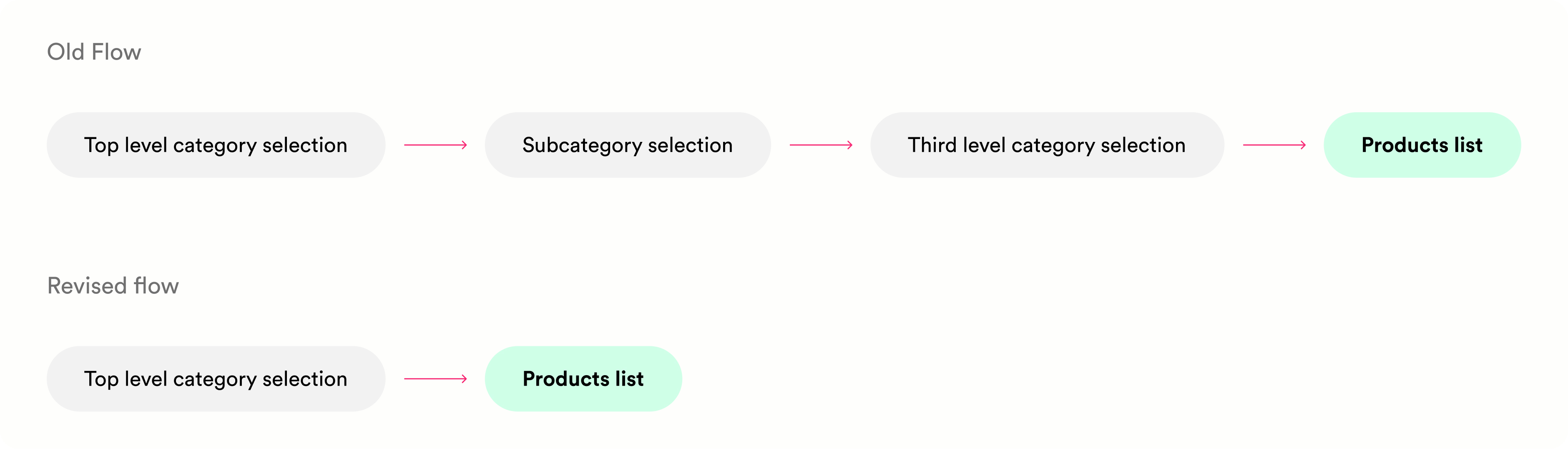
An audit of the old app revealed the core problem: a multi-step navigation that forced users through three decisions before they ever saw a product. That was the first leak to plug.
User testing
Tests on UserTesting.com confirmed that users found the deep category levels cumbersome, struggled to find products, and most never spotted the search icon in the toolbar. The experience needed to be simpler.
Measuring it, before building it
I worked with the team to instrument the funnel and agree on the metrics each change had to move:
Getting to a product: onboarding abandonment, drop-off, add to cart rate.
Checkout: cart abandonment, order volume.
Hypothesis 1: a lighter sign-up
If we ask for less up front, more people finish signing up.
The old app asked for a full delivery address during onboarding, a lot of typing before anyone had seen a single product. I cut it back to just location, auto-detected by default with manual entry as a fallback, and moved the full address to checkout, where it actually matters. A lighter first step means fewer reasons to drop off.
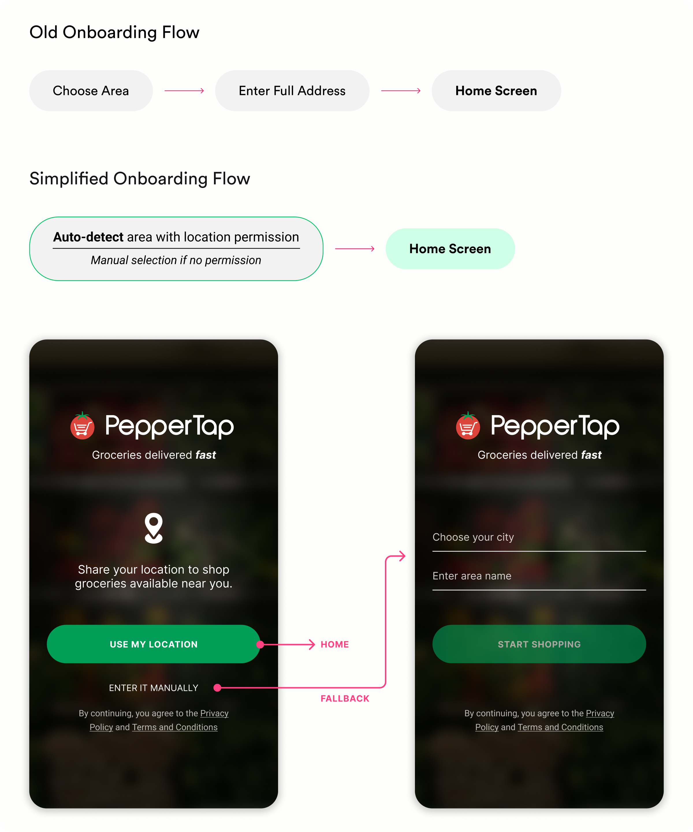
Metric I watched: onboarding abandonment.
Hypothesis 2: fewer steps to a product
The fewer steps it takes to reach a product, the fewer people give up before they find one.
Using the order-share data and test findings, I reorganised categories around real demand and merged the over-granular ones, validating the structure with the product owner and founders.
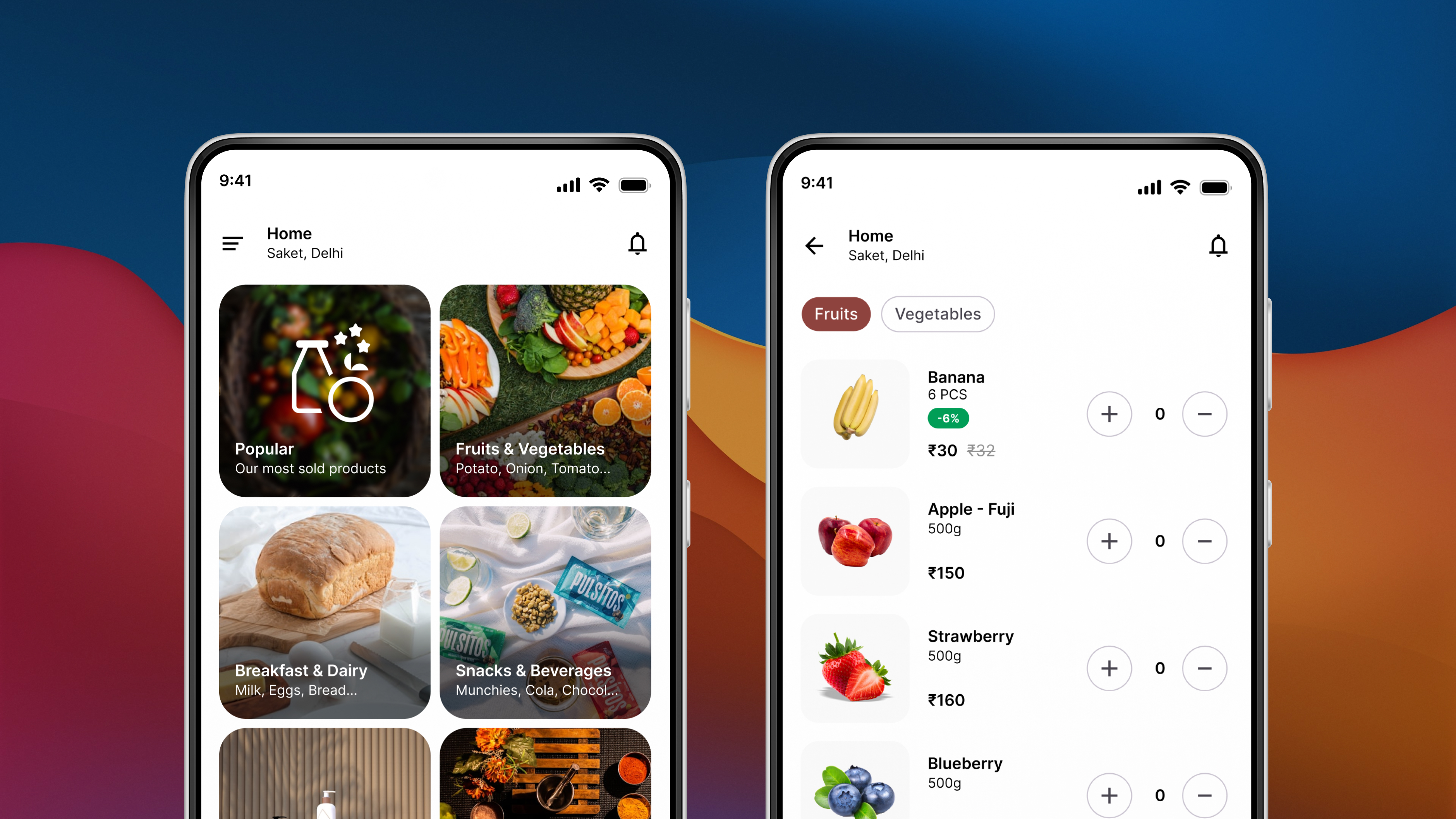
The result was 9 top-level categories. Tapping one on the home screen now leads straight to a product list, one tap instead of three.
With the structure simpler, I designed a clean, tile-based home screen that opens on the top-level categories with nothing else competing for attention. I moved to a red palette to stay consistent with the PepperTap logo and make the app feel more energetic and recognisable.
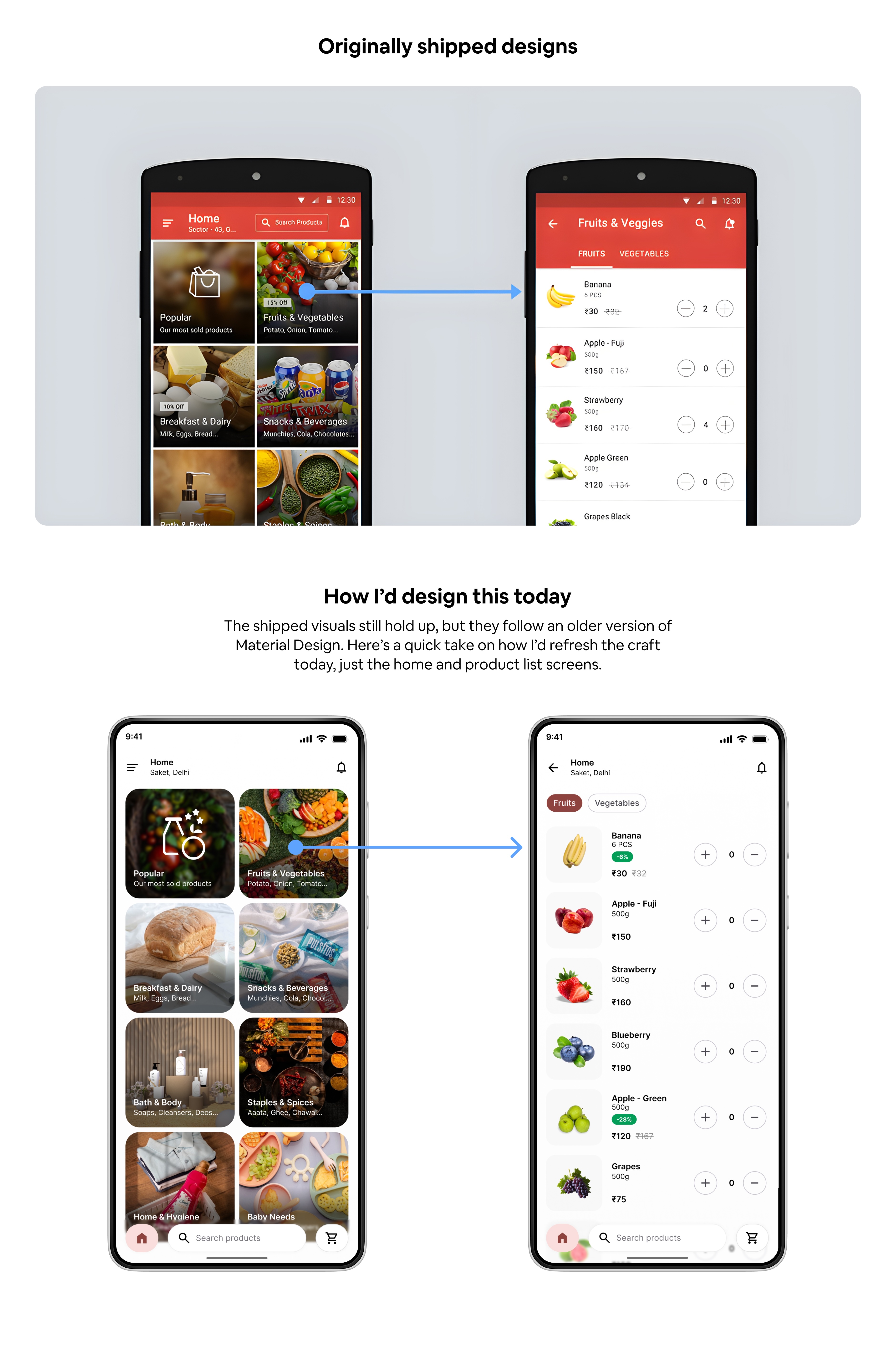
Metrics I watched: drop-off and add to cart rate.
Hypothesis 3: a checkout that converts
Fewer steps and smart defaults mean fewer abandoned carts.
Checkout is where intent turns into revenue, so I stripped it down to the essentials. Using our data, I pre-set smart defaults: most users chose cash on delivery and the earliest delivery slot, and any change was remembered for next time. I iterated through in-person sessions and UserTesting.com rounds.
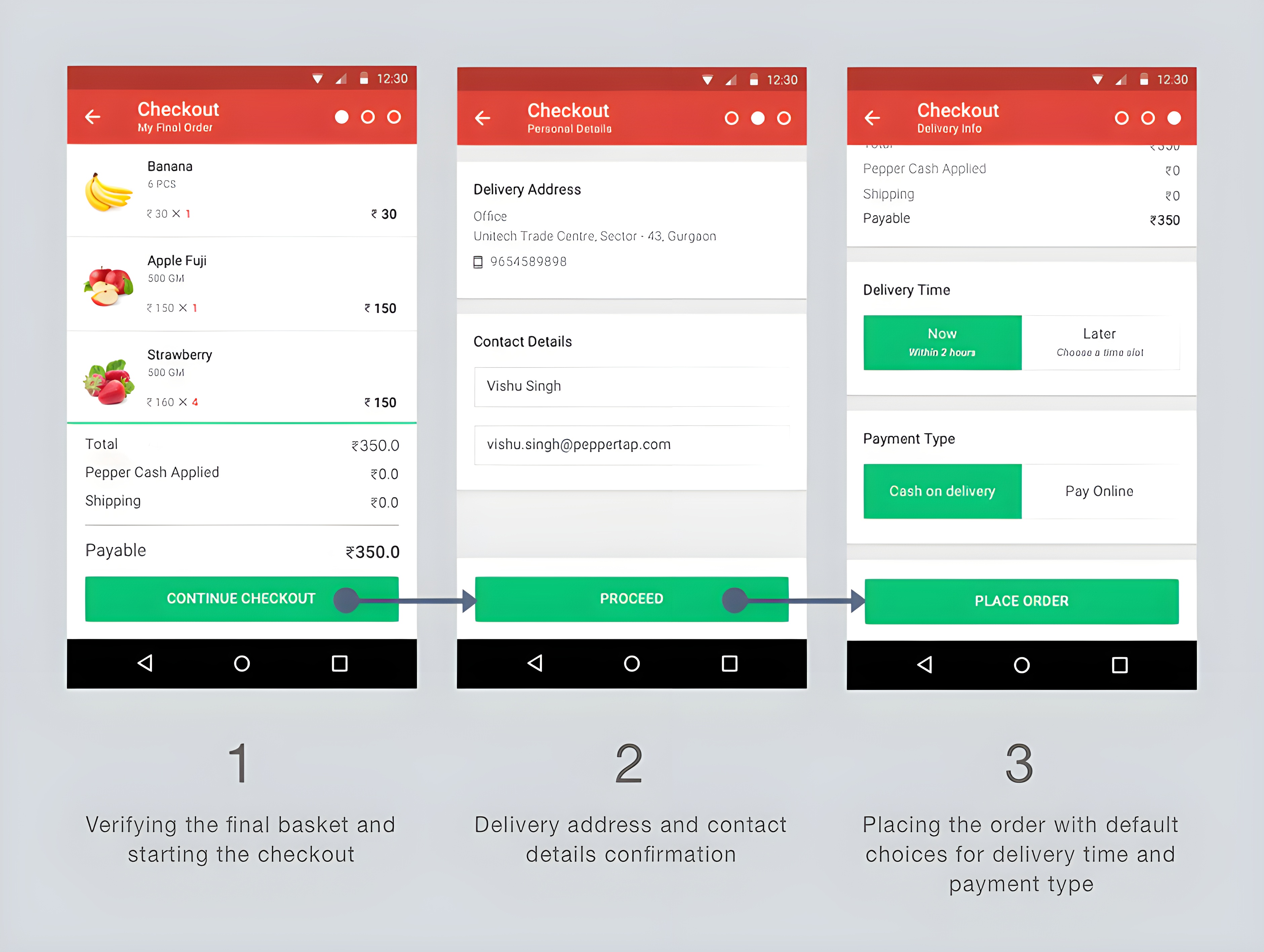
Metrics I watched: cart abandonment and order volume.
The result
On launch, the redesign moved the metrics we set out to move, from a lighter sign-up right through to a faster checkout and more orders, all feeding revenue.
What I’d do differently
I’d run proper A/B tests to isolate the impact of each change, rather than reading the funnel before and after launch. And I’d track retention over time, not just the immediate funnel.